
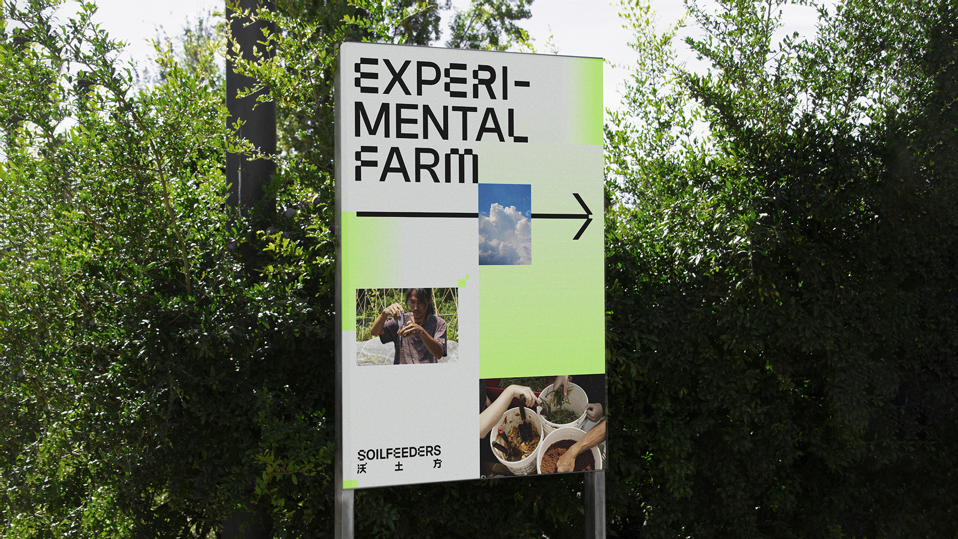




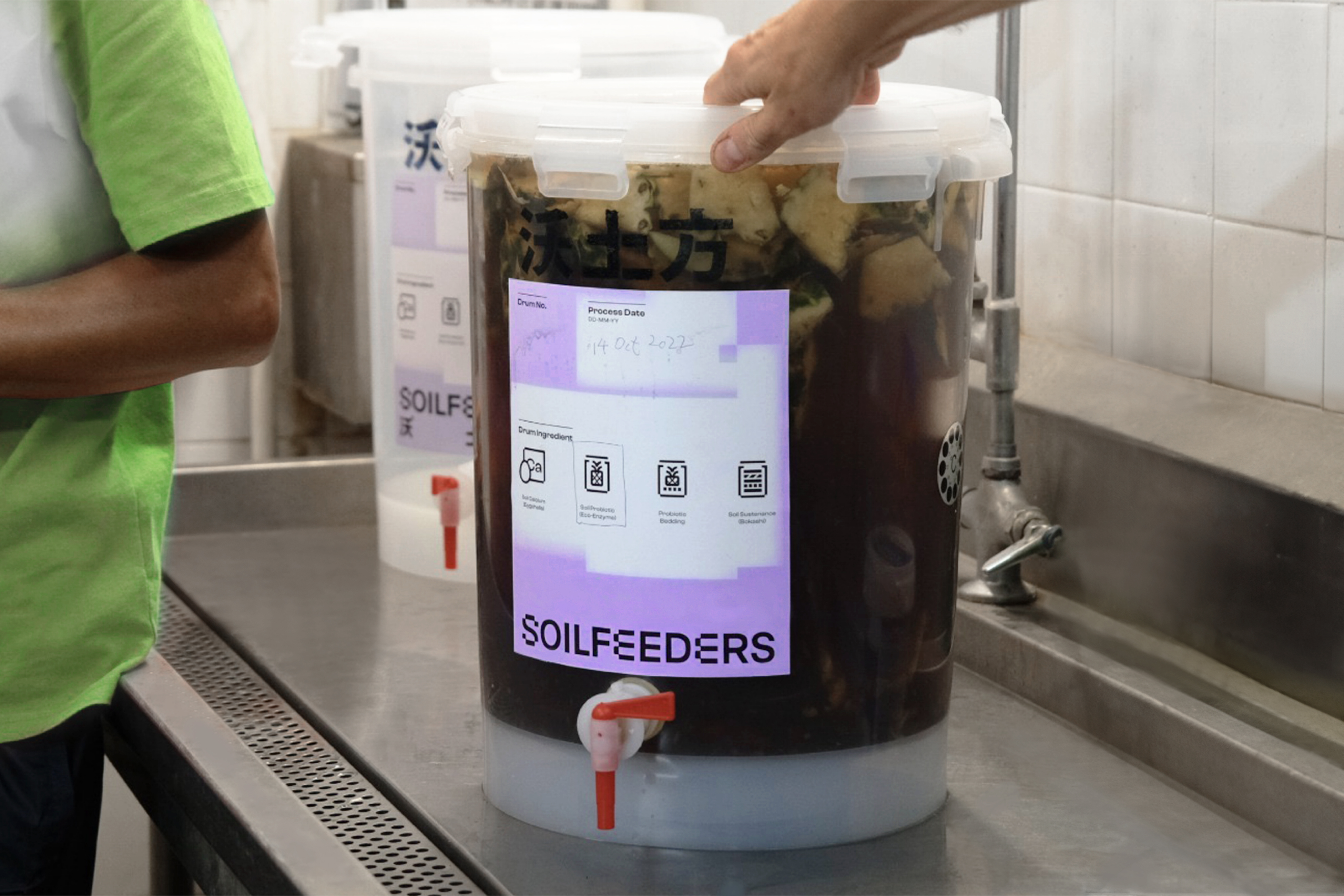

SoilFeeders is a cross-sectoral collaboration that seeks to establish Hong Kong’s circular food economy. The goal of the project is to give life to this science-backed and circular waste-to-soil-to-food solution for Asia’s hospitality visionaries.
The identity is inspired by the Bokashi Fermentation method used within the programme. With a transliterated meaning of Bokashi being “pixelated”, we visually convey this “breaking down” of food waste into a soil amendment that adds nutrients and improves soil texture.
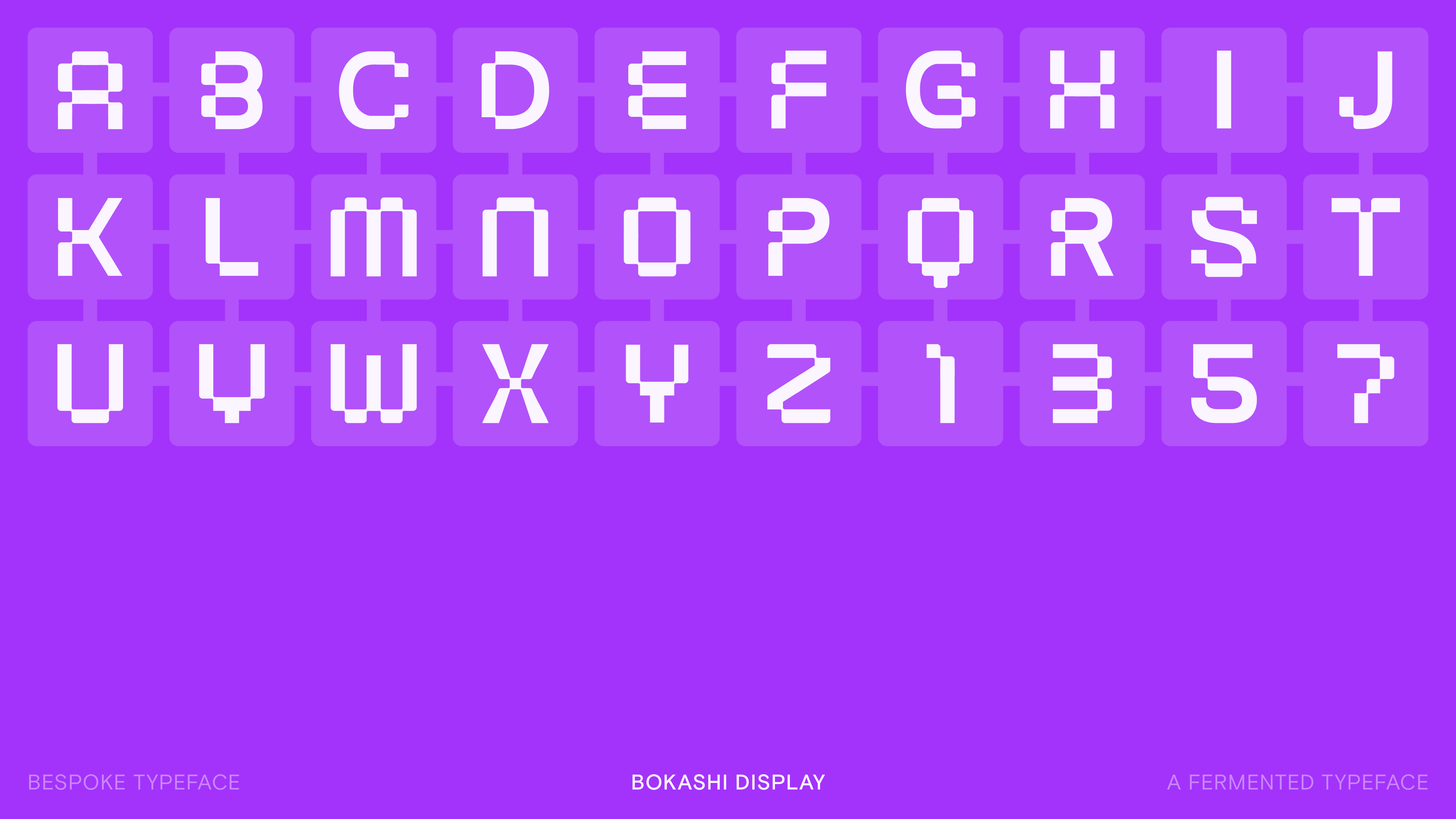
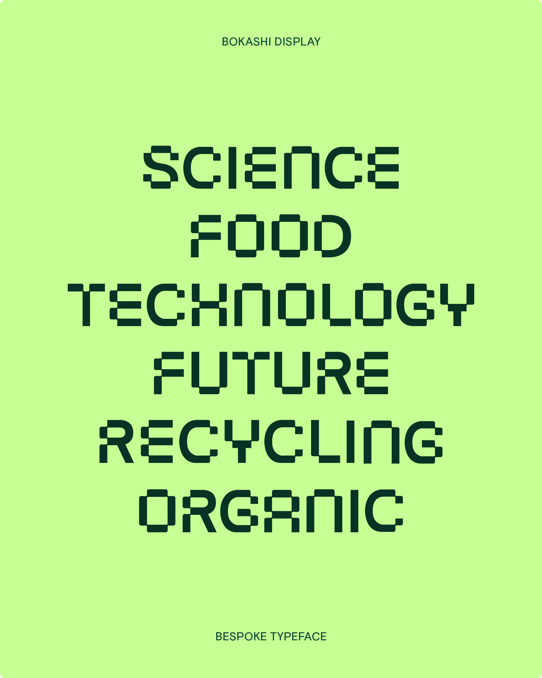
A custom display typeface is designed; the curved edges provide a more humanistic feel to the typographic expression. This concept of pixelations carry through key visuals, balanced with both scientific and human imagery.
Personal role
Lead designer; Art direction, Concept development, Brand strategy, On-site research, Type design, Motion design